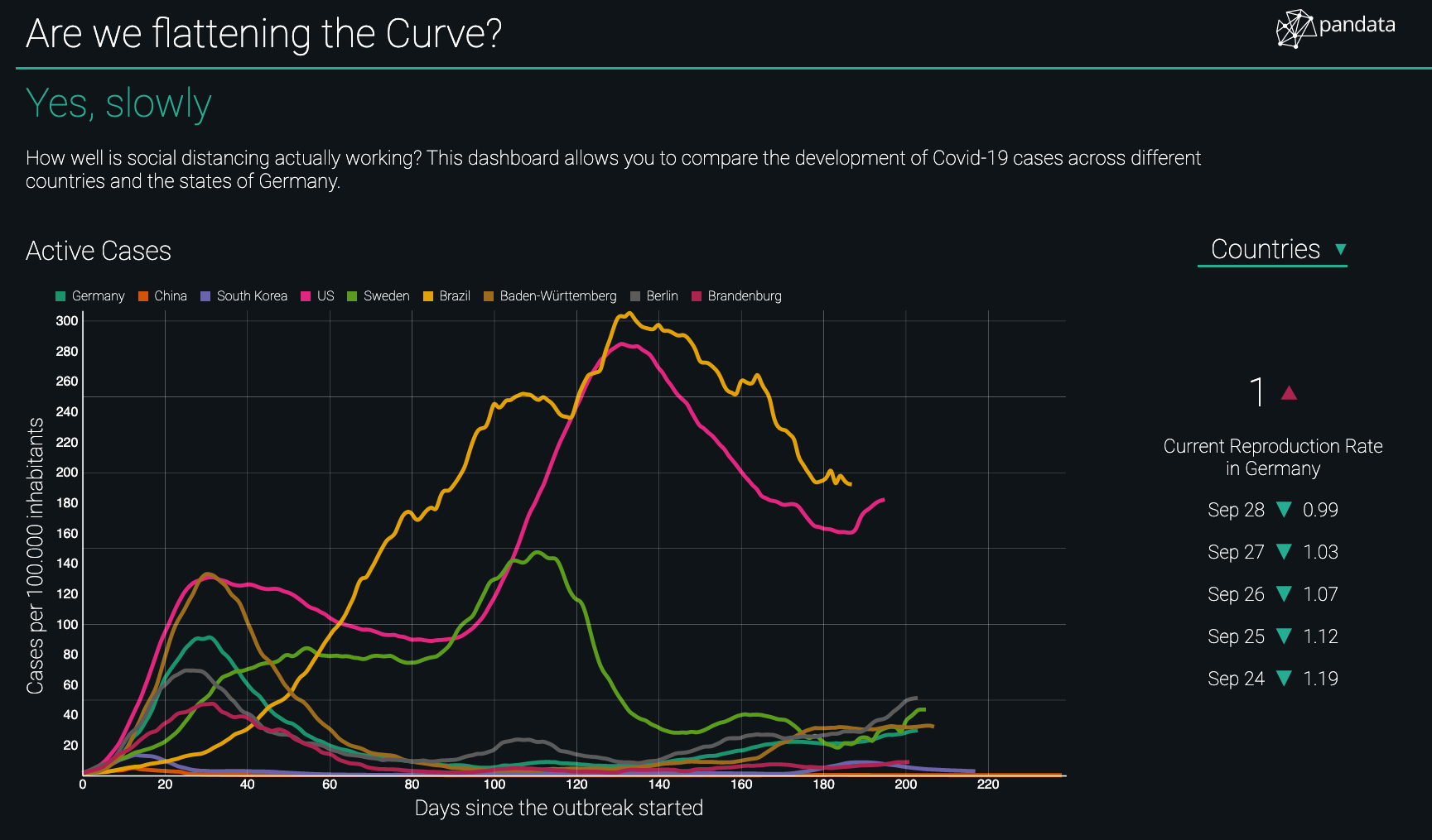
In the beginning of the corona-crisis we decided to use put our knowledge about data visualization to use and created a dashboard about the the status of Covid-19 infections. Contrary to many of the available dashboards, we focussed on the question whether the measures in place have the expected effect. Our dashboard allows to compare regions with different population densities and in different stages of the infection. We have built a model taking into account the average duration of the sickness and can thus compare how effective the individual measures in each region are. Furthermore our dashboard allows comparing individual German states with other countries, combining data from Hopkins-University and the RKI. After four months with the dashboard in operation, we are happy that the charts as reliable as in the beginning.
Check out https://flattenthecurve.pandata.de/!